Project

Gigaclear
UX redesign for an ultrafast rural broadband provider
Gigaclear needed to increase online conversions, and were experiencing a high number of drop offs from their online buying journey and low overall site engagement. So they came to us with a view to carry out user research and refresh their website.
Gigaclear
Research UI & UX Design Branding
Broadbrand Provider
2021-2022
By conducting extensive UX research, I established the solid foundation necessary for a successful brand update and website refresh that elevated the UX and UI. As a result, the new website achieved a decrease in bounce rates, while simultaneously increasing sales and conversions. In order to achieve this, I executed a variety of methods including competitor analysis, UX audit, tree testing, desk research, and interviews, which enabled me to create informed personas, user journeys, and wireframes. I transformed these wireframes into prototypes, which I tested and iterated upon until final designs were achieved. Additionally, I created brand guidelines and used them to establish an atomic component library, even animated several components and built up the screens from there.
I had a lot of fun taking this project from end-to-end, from research and UX right through to UI and branding. In doing so, I discovered some unexpected synergies of different research elements, such as competitor analysis alongside a UX audit, which is a great way to get inspiration for a site refresh, alongside the usual moodboarding. What's more, all of these great behavioural design techniques that I discovered during testing, all aimed at efficiently guiding users through the primary checkout journey, could equally be applied to any e-commerce project or form filling flow.

Emoti
Designing an automated analytics platform
Once we became aware that many people struggled to understand their analytics, it became our mission to build a platform that would simplify and democratise analytics so anyone could understand it. Whilst undertaking the significant UX/UI challenge of providing a solution that, as a challenger brand, improves upon the Google Analytics formula.
Pomegranate Media
Branding Visual Design UI & UX Design Marketing
Analytics & AI
2022 - 2023
In order to create Emoti, I began figuring out the design principles and personality of Emoti, and then built the design system and the UI through atomic design, from the ground up. Along the way, I finalised on a branding to give everything a cohesive look and feel. As an end-to-end solution, I worked on Emoti UX and interaction design to create a streamlined user experience. Before finally giving it a slick user interface, which users seemed to love!
As the lead product designer, I had to take the idea of automated analytics insights and approach it at a new angle, an orthogonal attack, where as a challenger brand we could disrupt the market, whilst remaining different enough to Google analytics so as not to play them at their own game, so that they couldn't pivot and crush us as an established giant. I learnt that less is often more, especially when it comes to Information Architecture and that data visualisation is better when it contextualised the information and best when it serves those insights to you on a plate.

Hive²
Architecting a platform for collective intelligence
During the pandemic, the need for remote collaboration became deeply apparent, but there appeared to be a lack of project management tools for 'bottom-up' self-organisation and collective intelligence, whilst new emerging technologies were finally making the promise of decentralised online organisations a real possibility. I decided to undertake this project in order to see if I could design a tool around the 3 universal motivators, autonomy, self-mastery and purpose, to increase a collaborator motivation, initative and creativity.
Client Name
Visual Design UI & UX Design
Client Industry
January 2023
In order to create Hive², I looked for inspiration from nature, particularly eusocial insects and the emergence of intelligent group behaviour that could be said to be 'more than the sum of their parts', from their ability to self-organise and coordinate useful work in a decentralised way. Whether that was from the stigmery of termites, the creation of environmental traces which other hive members could then build upon, to the quorum voting of bees, which enable them to come to a consensus as to where to place the next hive. This research lead me to look into group sense-making and coupling it with collective decision-making tools.
Whilst designing a super app which combined all the necessary tools for remote collaboration was a noble goal, interviews and testing revealed that most collaborators just wanted a single tool that could be integrated or combined with their current workflow of existing tools. It also highlighted the need for domain-specific collective intelligence tools, so that the dashboard could be tailored to a particular problem area or data landscape. Finally, our research revealed what collective decision-making tools and democratic protocols worked in different situations, as well as their vulnerabilities. In most cases, consent based voting, whereby proposals could be presumed to be approved, unless vetoed, worked as the most efficient protocol for most decisions made. However, we found quadratic voting to be most powerful, when the goal was to understand the decide upon multiple preferences, for its ability to aggregate the degree of one's preference in a fair and robust way.
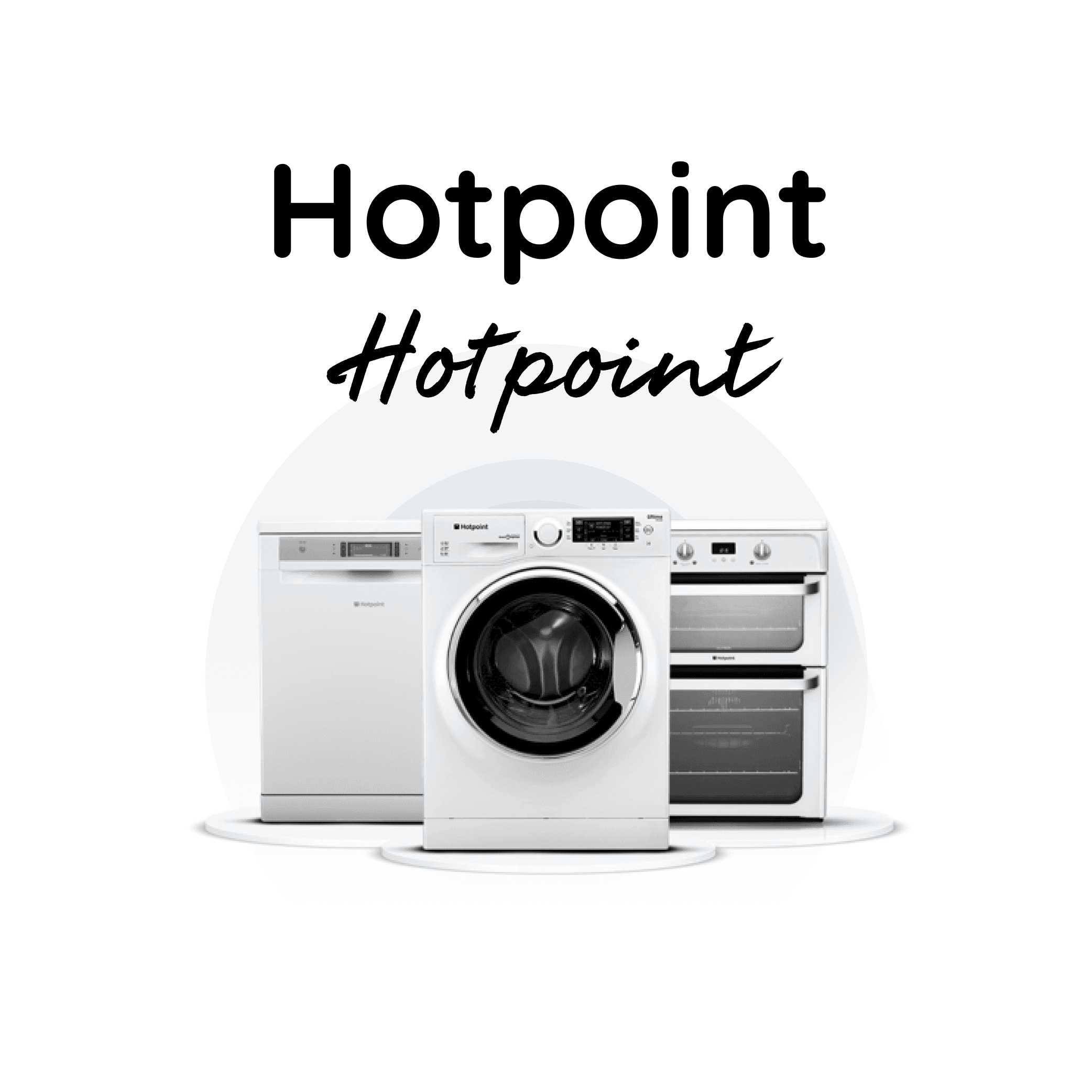
Hotpoint
Creating a streamlined parts buying experience
Hotpoint are an international white goods manufacturer, from fridges and freezers to washing machines and dryers. However, like all appliances, sometimes their products break down and are in need of repair. Our design agency was asked to redesign and improve their spare parts buying experience, so engineers to more quickly find the parts they needed to fix the appliances for the end user. The website needed to be fast, smooth and easy to use.
Client Name
Visual Design UI & UX Design Interaction Design
Client Industry
January 2023
Starting with a thorough competitor analysis and user journey mapping, I swiftly created prototypes and conducted testing for the Hotpoint parts site's redesign. My primary emphasis was on refining the interaction design of the advanced adaptive search and filtering features, along with optimizing the checkout journey. As a result, engineers experienced reduced time in locating their required parts, and customers witnessed a notable improvement in completing the checkout process. These enhancements led to remarkable outcomes, including a substantial 66% increase in monthly revenue and a commendable 36% decrease in the cart abandonment rate.
Throughout the project, several key learnings emerged. The advanced adaptive search and filtering functionality, as well as the optimized checkout journey, played a pivotal role in enhancing user satisfaction and streamlining processes. The results spoke for themselves, with a notable increase in monthly revenue and a significant decrease in cart abandonment rate. Lastly, the meticulous attention to interaction design throughout the project, from the search functionality to the side filter and checkout basket, demonstrated the importance of seamless and intuitive user experiences.

Consciously
Holistic health & wellbeing app and website
Consciously had a vision of making whole body health accessible to all, by connecting practitioners to seekers. I was tasked with designing the app and a website that communicated the value proposition to users and practitioners as well as investors too.
Client Name
Visual Design UI & UX Design
Client Industry
January 2019
Beginning with the user research, I was able to create user personas and plot their journeys. I then designed the structure and logic of the app, followed by the designs of each screen and a clickable prototype. I then following a similar process for the website, also branding both. The end result was a smooth user experience for the app and website, with a calming and relaxing user interface and brand look and feel, that invokes the feeling we wish the user to feel from using our app, utilising illustration, imagery and animation for maximum effect.
As the first project where I was the lead product designer, there was a lot to learn in terms product strategy and leadership. I learnt the importance of gaining alignment early on, through stakeholder workshops, so everybody's input and voice could be heard, which helped to ensure stakeholder buy-in later on. I also learnt the importance of constraining the focus area for a prototyping sprint to only certain sections or features of an app at a time, and the need for user stories to keep everybody's user-centric hats on. Lastly, running the branding, wireframing and prototyping process by actual users played a vital role in bringing the wellbeing and holistic health app and website to life, setting the foundation for a successful and impactful digital platform.

Ogury
Brand & web redesign for a mobile ad-tech company
Ogury had a complex product and unique proposition but struggled to communicate this digitally in a clear and engaging way. What’s more, their original site had an inconsistent branding and was in dire need of an UI update.
Client Name
Branding UI & UX Design
Mobile Ad Tech
2019 - 2021
I began by collaboratively working with Ogury to help them rework their branding, developing a whole new brand look and feel. Once I created and gave them the new set of brand guidelines and visuals, I then applied them to both the new website and the new marketing materials for a fresh new look. In order to design the new website, I firstly wireframed and usability tested the prototype, before designing them into slick mockups with a consistent brand identity and to deliver them a streamlined user experience with impactful modern visuals, to give them a competitive advantage.
As my first client project at Pomegranate media, I learnt the importance of cohesive brand narratives, intuitive user experiences, and innovative design elements in enhancing engagement, conversion rates, and overall brand impact. Firstly, I saw how a comprehensive brand refresh, complete with new brand guidelines, could result in a clean and visually appealing style that conveyed Ogury's identity effectively. Secondly, the optimization of the user journey and information architecture, particularly focusing on enhancing the mobile experience, led to streamlined interactions and a deeper connection with the brand. Lastly, the site refresh with cutting-edge interactive design, animations, and video heroes provided Ogury with a competitive advantage, re-energizing their brand presence and captivating their audience.